November 10 - December 23, 2017
Oceans
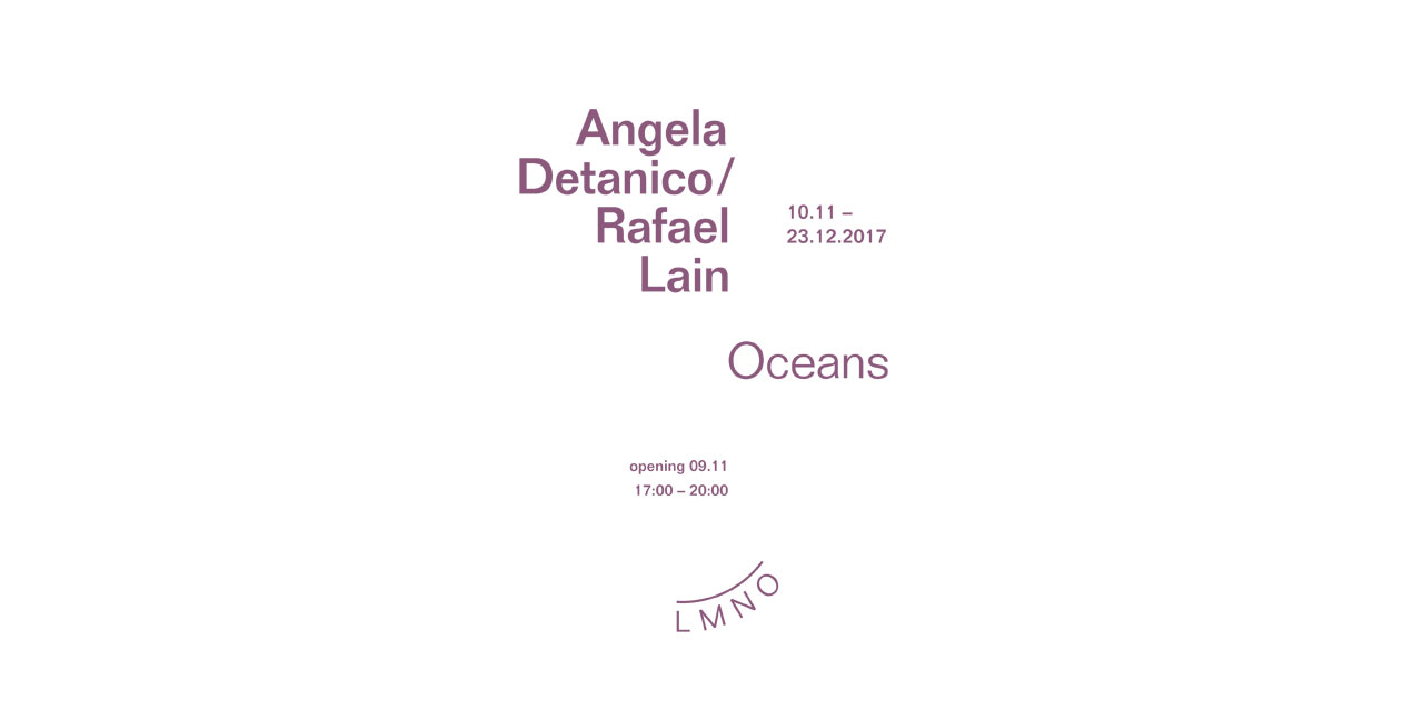
Oceans
In their second monographic exhibition at LMNO Brazilian artists Angela Detanico & Rafael Lain invite us to an exclusive discovery of some of the fruits of their residency at the prestigious Villa Kujoyama in Kyoto.
The exhibition centres round the idea of a Japanese garden. Nature is constructed in it, but it can also be contemplated. Materials and the play of scales reverse roles. The white gravel echoes the flow of water.
On the floor of the gallery is a sculpture from the Amplitude series. This is a typographical work based on the principle of laying concentric circles, akin to the propagation of waves on a body of water. One circle equals an A, two circles are a B, and so on. If the visitor counts the circles, s/he will decode the name of the exhibition.
In continuity with this series, which includes the sculpture ?Flow? which LMNO had presented at Art Brussels last April, LMNO wished to produce for the first time a multiple printed in 28 copies, using the same typography to write the word ?UNION?.
The exhibition is dotted with large-scale prints. These are landscapes. Distance vision makes it possible to perceive a skyline, mountains and other natural features. As you get closer, the image dissolves, to be replaced by the multiplication of a term which resonates with the image. Hence DISTANCE is repeated thousands of times in such a way that it constitutes the image of two mountains set wide apart from each other.
Another aspect of the aesthetics of Angela and Rafael is suggested by a video this time. Words become shapes and turn into clouds in the video ?The Clouds of Kyoto?, in which haikus by Basho (the renowned 17th century Japanese poet) are transformed into velvety, delicate expanses.
Clouds once in a while
Will grant a break to those who
Contemplate the moon
In the work ?Pleiades? small silver letters spin round on the wall of the gallery like stars whose positioning would be geo-alphabetical.
Our artists also came back from Japan with a desire for a conceptual form of Ikebana (the traditional floral art). Five vases for five letters. The number of flowers corresponds to the position of a letter in the alphabetical order. We are therefore in the presence of the term ?Still?, which evokes ?still life?. Not the way we usually translate this into French as ?nature morte? [?dead nature?], but as a calm, silent nature.
The series ?Musica Viva? is the result of a thorough analysis of the production of graphic artist Josef Muller-Brockmann who in the 1960?s created a number of posters for a musical festival in Switzerland. They were translated into the Helvetica Concentrated font style created by our artists in 2004. The principle was to measure the quantity of ink needed for the printing of each character of the Helvetica font. An ?i? will have a tiny diameter, whereas the ?w? has a large one. Meaning turns into form, coming even closer to the shape of a musical score.